
National Institute For Fitness
Mobile App Redesign


MAIN GOAL
Optimize a existing Mobile application to increase usage
TIMELINE
7 months
RESULT
Increase usage by 40 % within 3 months implementation
TEAM
3 UX Designers and 2 UX Researchers


National Institute For Fitness and Sport (NIFS)
NIFS, situated on the IUPUI campus, delivers exceptional service to over 3000 members using some of the most advanced equipment in the field. Additionally, they offer fitness evaluations and wellness plans of varying intensity to a diverse population. The NIFS's resources can be accessed online through desktop (web) and mobile apps. These function as a medium for users to schedule fitness classes, utilize customized workout programs, and interact with a range of fitness-related services provided.
What is the Problem?
The NIFS administration has noticed that there is a considerably low user interaction with the mobile app. This leads to the underuse of the app's functionalities and offerings, ultimately failing to captivate and maintain a significant amount of active users.
NIFS sought approaches to enhance user adoption and involvement for their mobile application.
Optimizing User Experience Through Comprehensive Research
We set out to learn more about how people use the NIFS mobile app. Our main goal was to figure out how users interact with it and understand why some might not be using it much, or at all. To get to the bottom of this, we decided to do two things: 1) observe users use the app and read what they say about it on social media forums, and 2) conduct quick, semi-structured interviews with NIFS users.
With this feedback in hand, we looked deeper into what users expected from the app and why some features weren't meeting those expectations. Based on everything we learned, we pinpointed areas where the app could be better. Our final step was to offer clear suggestions for improvement, ensuring that these were practical and based on real user needs and feedback.
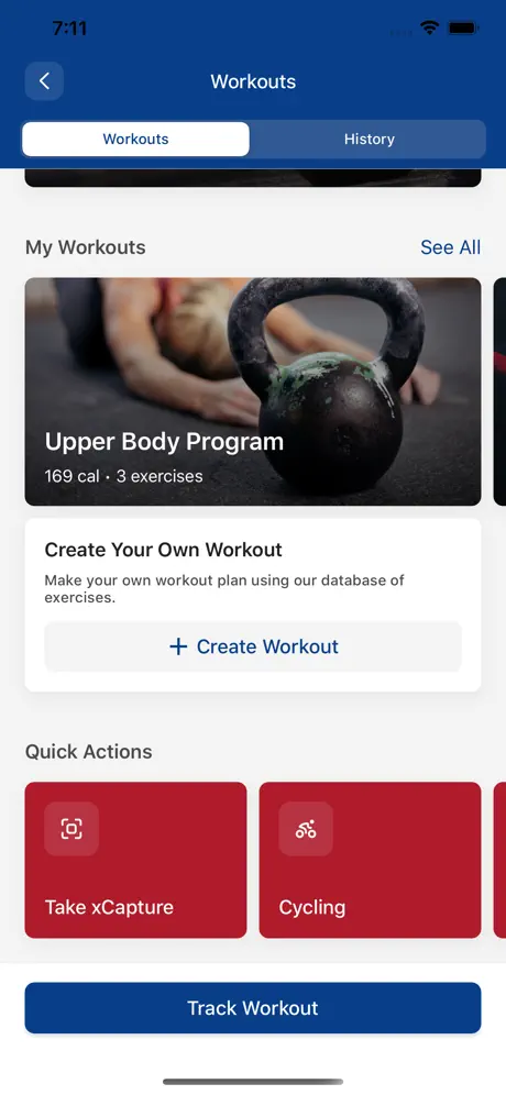
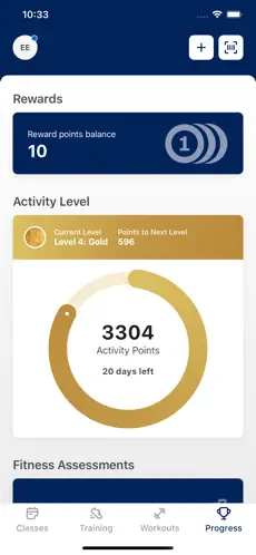
Usability Issues
Too many sub-menus with redundant menu options

87% of the participants expressed confusion and frustration because of the overwhelming amount of reduntant options


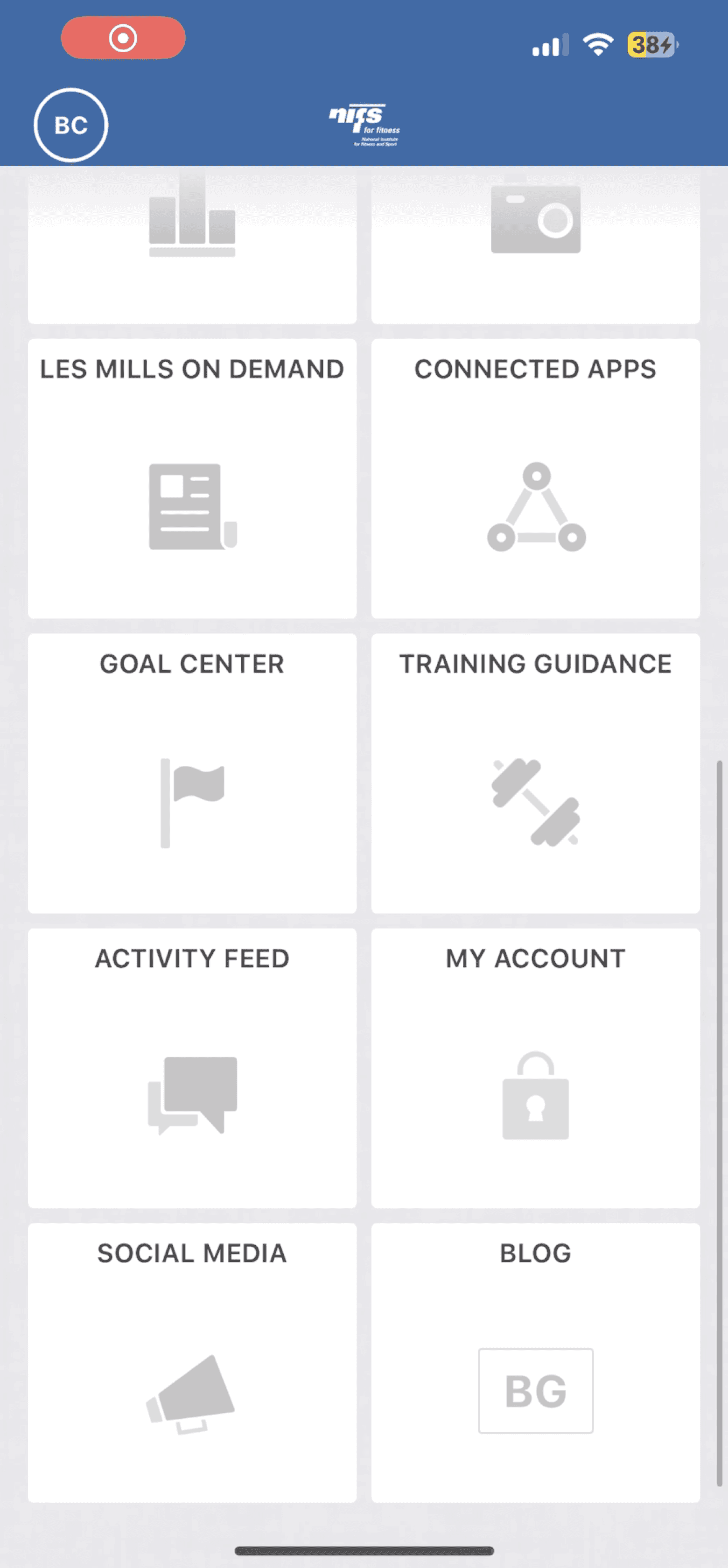
8 out of 16 sub menus are redundant
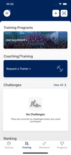
Confusing and Pre-defined filters for class registration
12 out of 15 participants needed to return to the main menu due to confusing menu categories causing navigation loops
Confusing and Pre-defined filters for class registration


6 out of 15 participants knew to click on filters tab
6 out of 15 participants attempted to click on the available options but encountered an error
3 out of 15 participants knew to click on change filters CTA